NutraHive Landing Website
Designed, coded and shipped solo, a live site pulling real meals from the client's API
NutraHive needed a public website that could explain two things at once: a nutritionist-led meal planning product, and the physical cafe and kitchen behind it. This case study isn't about a user problem I untangled, it's about how far solo I took this project, from first Figma wireframe through to a coded, responsive, API-connected site running in production. It's a look at how I actually build, not just how I design.
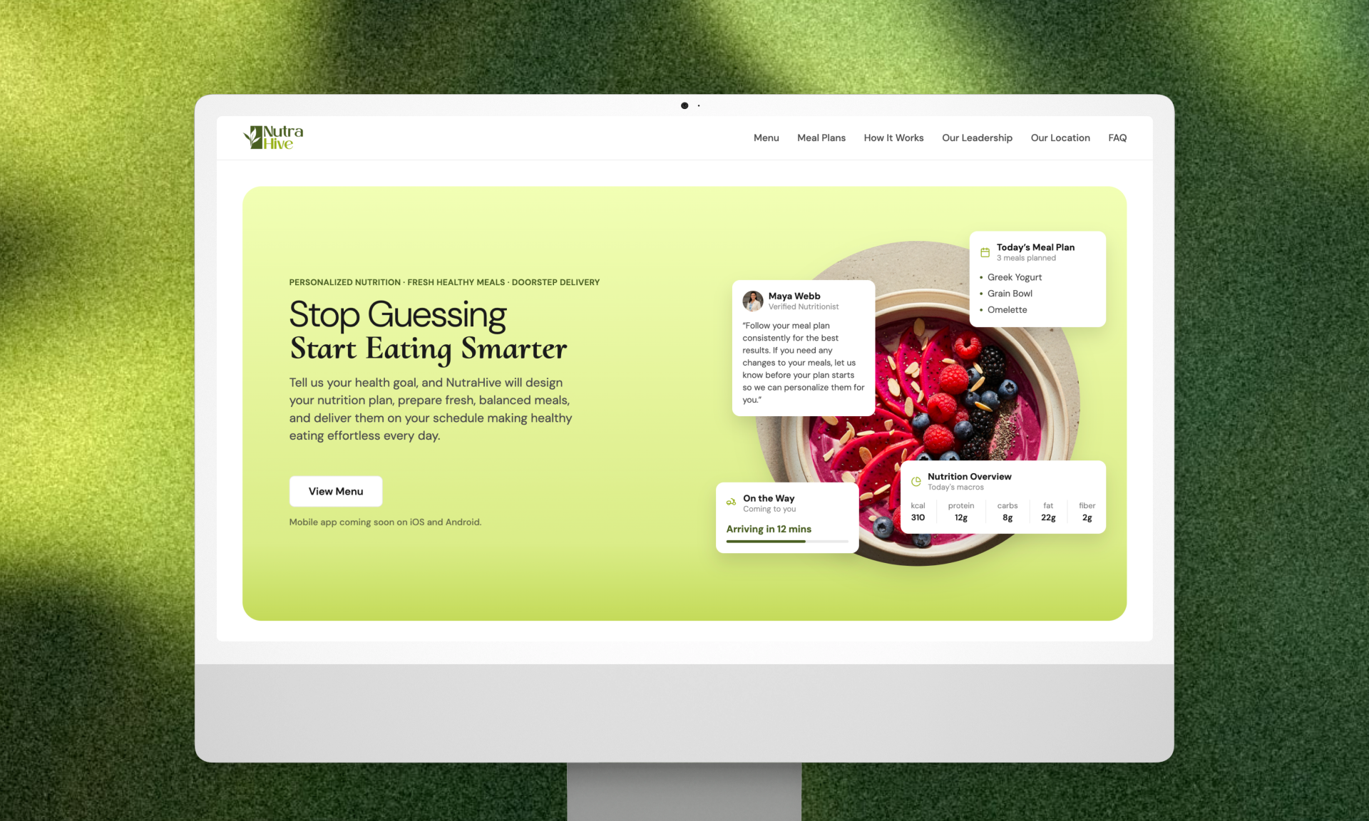
The homepage as it runs today, designed and coded end to end.
My Role
I took this website from a blank Figma file all the way to a live, coded, API-connected site, solo, with no prior landing page or reference to start from. I designed the wireframes and full visual design in Figma, then moved into Figma Make to build it out myself, writing and adjusting real code for spacing, layout, animation, and API integration rather than handing off a static design. Responsiveness across desktop and mobile was part of the design brief from the start, not an afterthought bolted on after the desktop version shipped. I also built and ran the AI workflow behind the build myself, covered in the next section, which shaped how efficiently the whole thing came together.
How I Actually Built This
An AI workflow built for cost, not just speed
I didn't have a paid Claude plan, so I built around ChatGPT's unlimited one instead. After each round of changes in Figma Make, I fed it the full exported codebase so it could write back precise, code-aware prompts, cutting down wasted iterations in the one place token usage actually costs something. Worth being straight about this: today, a direct MCP connection between a builder like Figma Make or Lovable and Claude or ChatGPT would do this loop automatically. I didn't have that access at the time, so this manual export-and-paste loop was the workaround, and it held up as a genuinely economical one, not just a stopgap.
Working through a provided API, not just around it
The meals API was developer-provided, raw XML, with no fields for tags, diet suitability, or featured status. I derived those client-side from the real nutrition values instead of hardcoding labels, and skipped faking a "Most Popular" sort since there's no real purchase data behind it.
1function getTag(kcal: number, protein: number, fiber: number): string {2 if (protein >= 40) return "High Protein";3 if (fiber >= 6) return "Fiber Rich";4 if (kcal <= 250) return "Light";5 return "Balanced";6}7function getSuitable(kcal: number, protein: number, fiber: number, diet: string): string[] {8 const result: string[] = [];9 if (kcal <= 300) result.push("Weight Loss");10 if (kcal >= 450 || protein >= 40) result.push("Weight Gain");11 if (fiber >= 5 && diet === "Veg") result.push("Diabetes Friendly");12 return result.length > 0 ? result : ["Balanced"];13}Visual craft that took real thought
Most of the motion on this site is standard, hover states, button lifts, an auto-scrolling tag row, and isn't worth explaining individually. A few things weren't default:
The entrance sequence. A full-viewport overlay shrinks into the hero card's exact shape on load, while the content fades and blurs in beneath it.
The watercolor "boiling" illustration. Three hand-painted frames of the same bowl, cycled fast to fake a hand-drawn boil, instead of a generic stock icon.
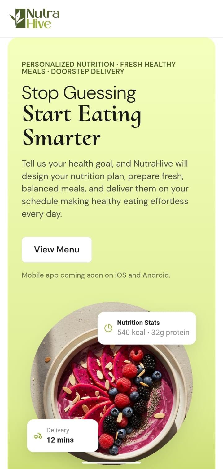
Re-writing the hero for mobile. On desktop the hero runs two columns with four cards floating over the food image. Compressing that to one column meant deciding what each card was for, not just where it would fit. The nutrition summary and the delivery estimate answer what you get and when it arrives, so both stayed. The nutritionist quote and the meal list are supporting proof, so they came off the hero entirely, and the five metric nutrition row collapsed to calories and protein on one line.
Outcome
The site is live at nutrahive.co. It's early, so there's no traffic or conversion data yet to report. What this project demonstrates isn't a metric, it's range: taken solo from a blank Figma file to a coded, responsive, API-connected production site, using an AI workflow built as deliberately for cost as for speed.